Typography for Lawyers by Matthew Butterick is a book worth buying if you’re a lawyer (or law student). Unless court rules specify a particular font, a lawyer should consider upgrading his pleadings by employing thoughtful, readable typography.
For years (and I am not yet a lawyer), I have used Gill Sans and Bembo Monotype (Ã la Edward Tufte) for superb, classic readability. Since entering law school, I have had greater opportunity to interact with text-heavy documents and have branched out into incorporating other beautiful and compelling fonts.
Typography is, of course, not entirely about font choice. It is about spacing, formatting, and an overall intuition or thoughtfulness about how text layout conveys information. Typography plays a huge role in the ability of a reader to continue reading the document by decreasing or increasing eye strain over time. Typography is also a substantial factor in the speed with which a person can read a document: the features of glyphs, their interrelationships, and the spacing around them contribute to how fast your brain can apprehend the text and its meaning.
And typography conveys emotion. For instance:
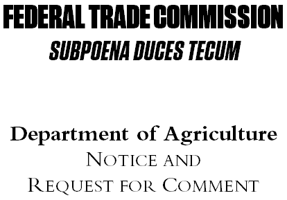
Which agency would you rather hear from?
In my opinion, lawyers resist using anything but Times New Roman, likely because courts themselves, which are certainly not the paragons of cutting edge technology, use Times New Roman by default. Judges don’t know better, and more importantly, their law clerks don’t know better. Lawyers, typically risk-averse, do not want to be seem too avant-garde with respect to pleadings, because they fear having the pleadings struck (rejected) for violation of rules. So they file unreadable documents in Times New Roman.
Certainly, because the Supreme Court of the United States commands parties to use the Century Family of fonts, petitioners and respondents should do so (unless they are proceeding in forma pauperis pursuant to S. Ct. R. 39). And if your local court requires a certain family of fonts, obey.
But most courts merely specify minimum sizes. Some require serif fonts for the text (a good rule of thumb, unless you’re Apple and can’t resist using a well-kerned sans serif). Courts often specify Times New Roman as an example, if only because the rule drafters lacked creativity, not because the Courts really really want to read Times New Roman. Courts want to read pleadings that are easy to read.
Good typography will not make an argument more cogent, but it may make the arguments in the pleading feel that way. Bad typography creates substantial emotional obstacles, because it strains the mind. Good typography helps the brain read faster because it gets out of the way of the message. Good typography prevents your reader from being burdened and helps him to feel edified.
Matthew Butterick has been decrying poor legal typography for some time, encouraging the profession to become more readable—more beautiful. To me, he has a perfect job: part lawyer, part typographical consultant, and I hope his book, which should complement his very useful website, is richly successful.
 RSS Entries
